Micrographics Creator
Design dense, technical visuals for launches, docs, README headers, wallpapers, and social posts with animation in minutes.
- date
- 2026-05-14
- duration
- May 2026 - Current
The idea
Micrographics are the small, dense details of print design: registration marks, hairline rules, index plates, care labels, measured scales. They make a poster, deck or interface feel deliberate. They're also slow to make by hand, and nearly impossible to animate without moving to a motion tool.
I wanted a tool where you start from a finished-looking layout, change what you need, and export a still or an animation in seconds.
Design and code
I designed the product and built it with Claude Code as my engineering partner. I set the direction, made the design and product calls, and reviewed every change; Claude wrote much of the implementation. Working this way, design and engineering decisions shaped each other: I could see a problem in the design and get it traced to the code within minutes.
Design decisions
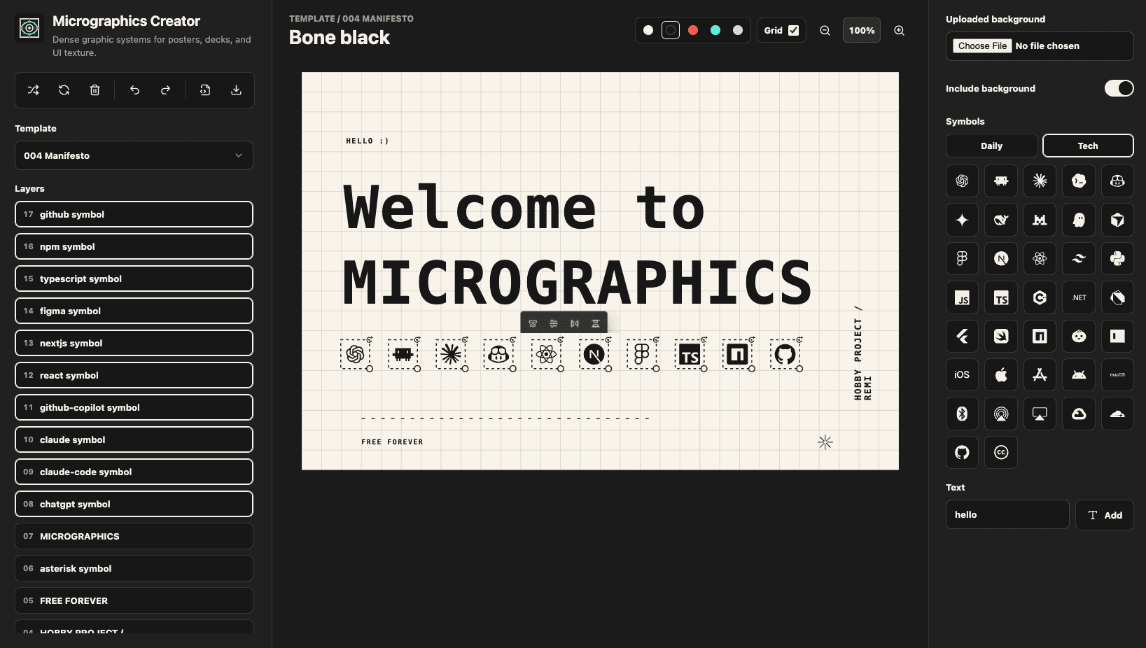
Quick start with templates: A blank canvas is intimidating, so the app opens on a finished layout. There are eight templates, each built around a different archetype: a minimal poster, an index plate, a level meter, a care label, an exploded parts drawing. They show what the tool can do and give people a structure to edit rather than invent.
Animation, added from feedback: The first version exported still images. People asked for motion, so I added entrances: dissolve, slide in from any side, or pop, each with its own duration and delay. Play previews the whole sequence on the canvas.
Grouping, so timing stays simple: Setting a delay on every item by hand got tedious fast. Grouping solves it: give a group one entrance and a stagger, and its layers take turns in the order they're listed. Groups can sit inside groups, each with its own timing, and dragging layers into a new order reorders the animation with no numbers to retype. Every template now opens with a group or two already animated, so new visitors find the feature straight away.
Export in the format you need: One Export dialog offers SVG, PNG at 1x, 2x or 4x, and animated GIF. It tells you which formats keep the animation, so nobody exports a still PNG expecting motion.
Technical decisions
Automated testing in CI: Every pull request runs lint, typecheck, a production build, unit tests and browser tests. That safety net is what lets me ship small changes often without breaking what's there.
Jest for logic, Playwright for what people see: Jest and React Testing Library cover the logic: animation timing, grouping, layout geometry, saving and restoring work. Playwright drives a real browser to check what users actually experience: dragging layers, playing animations, exporting files, and text landing inside the artboard as rendered.
Guardrails for AI-assisted code: Every change goes through the same pipeline: written with tests, reviewed by a separate agent before a pull request opens, then checked in CI before I merge. The tests are what let me trust code I didn't type myself, and move fast without breaking what people rely on.
Consistent formatting: ESLint and Prettier keep the code consistent, and a single lint warning fails CI, so code quality doesn't drift as the project grows.
Base UI for simple, accessible controls: Base UI provides unstyled, accessible building blocks (menus, dialogs, sliders, selects) that I style to match the app. I get keyboard and screen-reader support without fighting a component library's look.
Reusable building blocks: Templates are composed from shared helpers (rules, scales, mark grids, animated groups) rather than hand-placed one item at a time, so a new template is quick to build and inherits fixes automatically. Every entrance is defined once and drives the preview, the SVG and the GIF alike: what you preview is what you export.
Measuring real usage: Vercel Analytics, Speed Insights and Google Search Console show how people find and use the app and how fast it loads, which feeds directly into what I build next.
Iterating
Micrographics Creator has grown in small, steady steps: each update added one thing people could use straight away, from layer reordering and grouping to nested group timing, aligning a group as one unit, and templates that open already animated.
Each update came from watching how people used the tool. The latest, animated templates, came from new visitors not finding animation at all.
Results
The project has grown through search alone, with no ads or paid promotion:
From 10 to 670 clicks comparing its first month live with the three months after
From page 5 to page 1 on Google, average position across all searches went from 41 to 7.9
#1–2 for "micrographics generator", where more than half of searchers (56%) click through
12% click-through rate across 5,660 impressions
Cited in Google's AI answers 1,100+ times since July, growing from zero
What I learned
Designing and coding together makes both better: When I could see a layout was off by a few pixels, I could trace it to the code that placed it and fix the cause, not just nudge the design.
Tests are what make fast iteration safe: With the whole app checked on every change, I could ship small improvements often without worrying about breaking what people already relied on.
Start people somewhere finished: Templates did more for first impressions than any single feature. People engage faster when they're editing something good than when they're facing a blank page.
What's next
Keyboard shortcuts
Sharing a design by link
Accounts, so designs can be saved and edited across devices